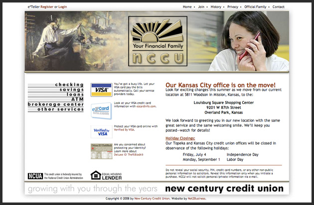
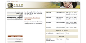
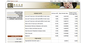
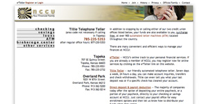
Transition from then to present time was one of the things which were important to the client. The home page features a Flash animation which punctuates this message. All sub-pages use a lesser high header but carry the theme forward. A new Corporate Identity, including a company logo and stationary design, was part of the project.


2 Comments
This website won 3rd place and with it the BRONZE medal in the Best of Topeka Web Contest 2009.
Judge Comments:
“Overall the website is clean, meaning not cluttered with a lot of text, which is very good.”
“The tie between the old and the new photos accomplishes their goal of showing they are old fashioned and current.”
“It is easy to find what you are looking for, especially how to log-in to the site.”
Incoming Links
Leave a Reply